1. Abstract
Humanities research produces a vast amount of data that needs to be visualized to understand and interpret the underlying facts. Modeling data with RDF based OWL ontologies defines a directed graph where nodes are the resources, and the properties the edges. Many digital humanities projects visualize the RDF graphs by flattening them into two dimensions. Although this representation helps researchers with recognizing the direct and indirect connections between the resources, it suffers from loss of information due to the overlap of nodes and edges. One can overcome this problem by visualizing the data as a 3D force graph. An interactive 3D visualization also introduces tangibility to the displayed data so that researchers can rotate the model to study the distribution of the data from every angle. The visualization tool is web-based and connected to a platform that serves the digital editions. This connection enables the users to access the underlying resources by directly clicking on the nodes.
Figure 1: 3D force-directed graph of Newton's scientific correspondence
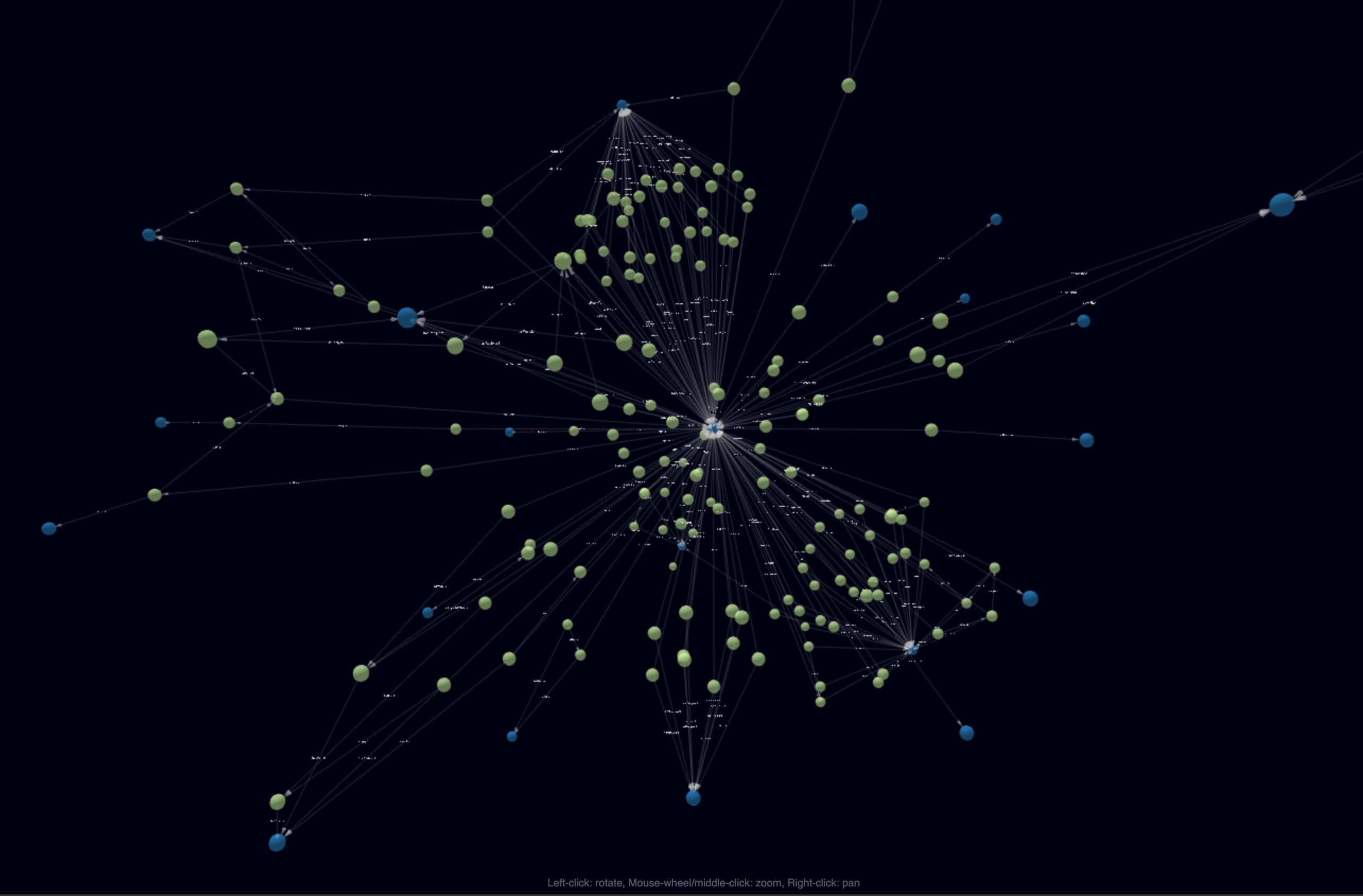
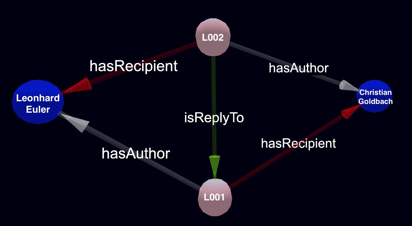
Representation of the data as a 3D force-directed graph is commonly used for scientific data (Paananen, Wong 2009), but it can be easily adapted to the humanities data as well. To illustrate this, we have chosen to visualize the early modern scientific correspondences. Our database consists of the correspondences of natural philosophers such as Leibniz, Newton, Leonhard Euler, and members of the Bernoulli dynasty. There is already a network that connects the digital editions of these correspondences and makes them openly accessible to the public through one platform (Alassi et al., 2019). This platform is a virtual research environment based on the Knora API (https://www.knora.org/), which manages and stores the data as RDF.Users of this platform can access and query the data online using Angular based front-end components of the API, Knora-ui (https://github.com/dasch-swiss/knora-ui). The 3D visualization tool will be integrated into this user interface and will be openly accessible online. Through Knora, one can derive the graph of the data in the JSON format directly from the triplestore, which is then employed to create a real-time 3D simulation (Figure 1). A configuration step defines graphical features, such as shape, colors, and labels of the nodes and edges (Figure 2). The repulsive forces prescribed on the nodes and edges prevent the overlays of the graph components, and spring-like characteristics of the edges restrain the movement of the nodes. This leads to the formation of clusters of objects that are well connected.
Figure 2: Sample 3D visualization of RDF triples.
Since time plays a crucial role in the study of the historical facts, an additional dimension has to be introduced into the model to represent the time (Schweizer et al., 2015, p.321). In the 3D model, this can be achieved by the dynamic appearance of the nodes relative to the creation date of the letters. All features developed for this tool will be generic and can be used to visualize any RDF based humanities data. We also intend to generate a virtual reality version of the 3D simulations to enhance the interaction of the users with the data.
Bibliography
Paananen, Jussi and Wong, Garry (2009), FORG3D: Force-directed 3D graph editor for visualization of integrated genome scale data, BMC Systems Biology, 2019. DOI:10.1186/1752-0509-3-26
Alassi, Sepideh and Schweizer, Tobias, et al. (2019) Newton virtually meets Euler and Bernoulli, DH2019, https://dev.clariah.nl/files/dh2019/boa/0421.html
Schweizer, Tobias and Rosenthaler, Lukas and Subotic, Ivan (2015) Visualizierung von Annotationen und Verknüpfungen in SALSAH, Geschichte und Informatik, vol.18/19.