1. Abstract
Why do so many data visualizations require sequential or hierarchical data? The sequential and hierarchical aspects of humanities data are often not the most important or interesting aspects. We’ve been exhorted to embrace the nonscalability and diversity of our data (Rawson and Muñoz), to disavow binary distinctions (D’Ignazio and Klein), and others are working to improve how we visualize uncertainty (Hullman). Creative and evocative visualizations abound, but they are rarely generalizable new approaches. Where are the new data visualizations for Digital Humanities work?
Based on work for a recent Princeton Prosody Archive (PPA) Editorial essay, I will share my experiences and failures attempting to visualize the seven scholar-curated collections within PPA. Categorization of the content in PPA is complicated because of the shifting meaning of the term prosody over time, encompassing both grammar and phonology as well as versification (Martin), and my visualizations reflect aspects of these two overlapping discourses in the form of the Linguistic and Literary collections within PPA.
The seemingly simple task of showing the relative size and overlap of all seven collections is actually quite difficult. A bubble plot or bar chart can convey relative sizes, but can’t communicate overlaps and are limited to sets of similar scale. Visualizing the relative size and overlap of PPA (4,792 items) alongside the original bibliography that inspired its creation is useful, but put in context of all of HathiTrust (16 million items) we see a laughable diagram that nevertheless demonstrates the value of smaller, scholar-curated bibliographies (more than mere collections) based on HathiTrust materials.
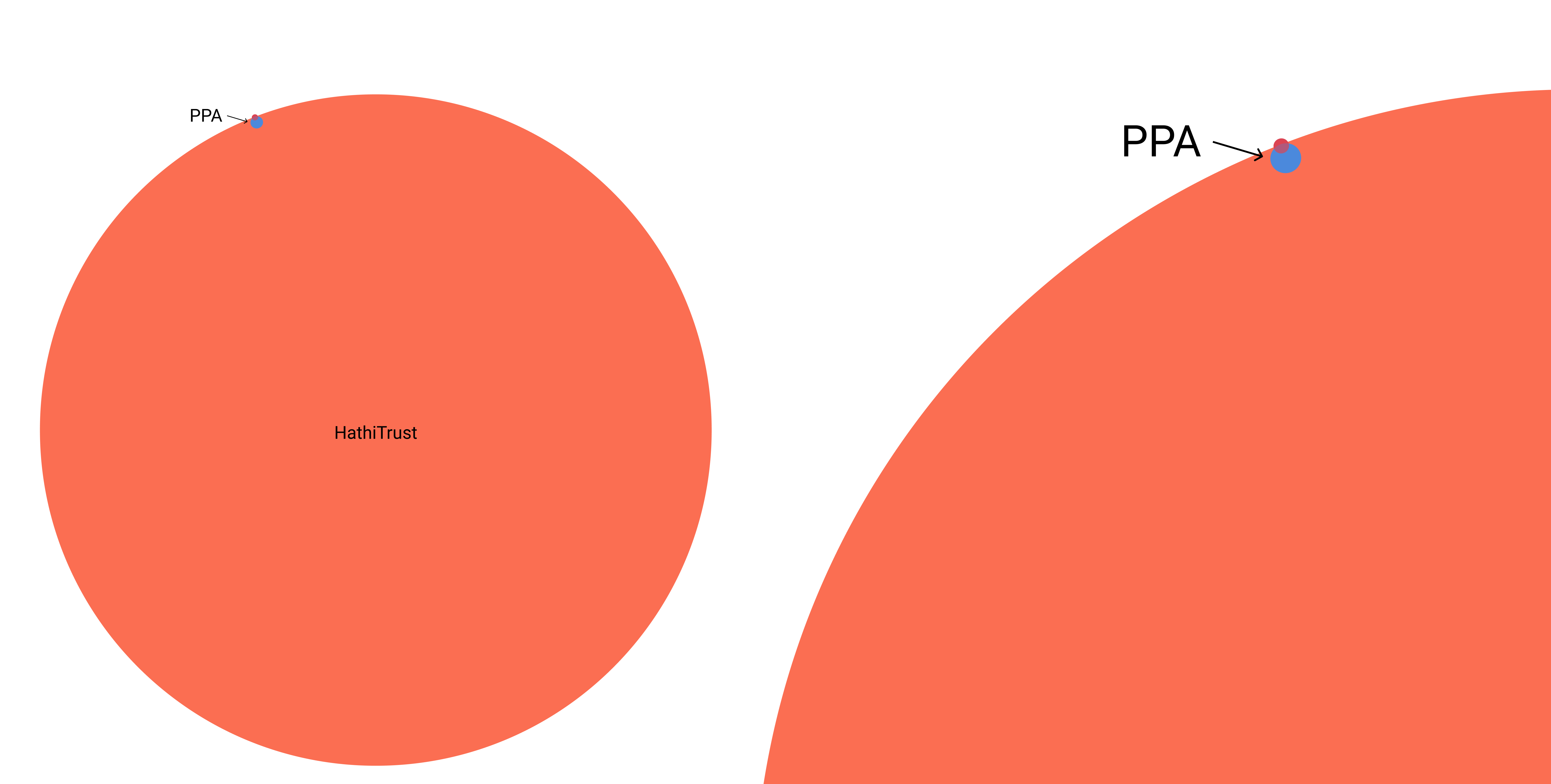 Figure 1. Venn diagram (left) and detail (right) of the relationship between PPA, the Original Bibliography and HathiTrust.
Relative sizes of bar charts are easier to read than circles, but a bar chart requires imposing an order. Euler and Venn diagrams (invented by mathematicians in the 1700s and 1800s) seem promising, but are limited in the number of sets, and also have the same problems with relative scale as bubble plots and bar charts. Treemap diagrams are useful for visualizing relationships, but only within a single hierarchy; likely because it was invented to visualize disk space utilization (Shneiderman and Plaisant). The UpSet plot is a relatively new solution to show “set intersections in a matrix layout” (Lex et al, 2014), which came out of bioinformatics, and is a powerful solution for this problem once viewers are oriented and trained to read an UpSet plot. Length proportional linear diagrams are another solution for set visualization (Rodgers et. al., 2015) which purport to improve set-related task performance, but they do not yet seem to be widely known or used.
After a quick overview of these visualization solutions and their limitations, I will demonstrate an experimental visualization I created as I worked on visualizing the PPA collections. It was inspired by the “warming stripes” climate change visualization (Hawkins) and a workshop series on p5.js called “Playing with Data” (Roth and Koeser). Vertical stripes are used to represent each item, with colored horizontal rows designating collection membership; interaction allows the viewer to focus on a single collection and see how it overlaps with others. In an earlier prototype, I sorted items somewhat arbitrarily by publication date. In my most recent prototype, items are ordered randomly to give viewers an overall sense of the distribution of the collections, but with interaction that allows a user to group all items in a single collection to allow focusing on overlaps with one collection at a time. Some might argue that a linear diagram would provide a more objective or efficient solution, but I’m less interested in viewers “accomplishing set-based task performance” than I am in the affective and aesthetic impacts (D’Ignazio and Klein) that make it possible to see and interact with these collections.
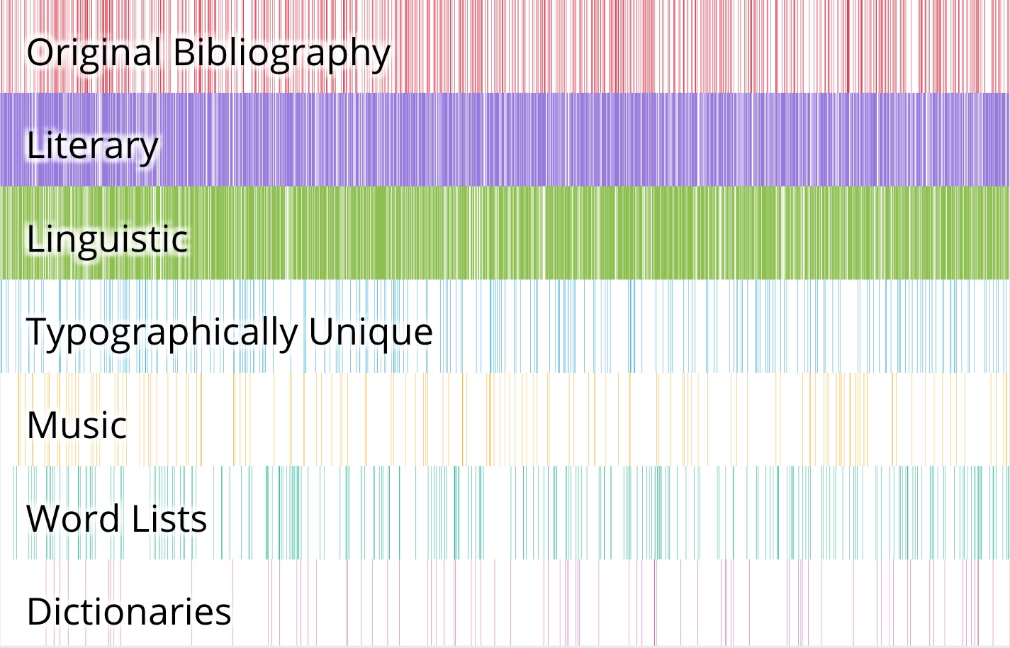 Figure 2. Screenshot of the prototype in its default view.
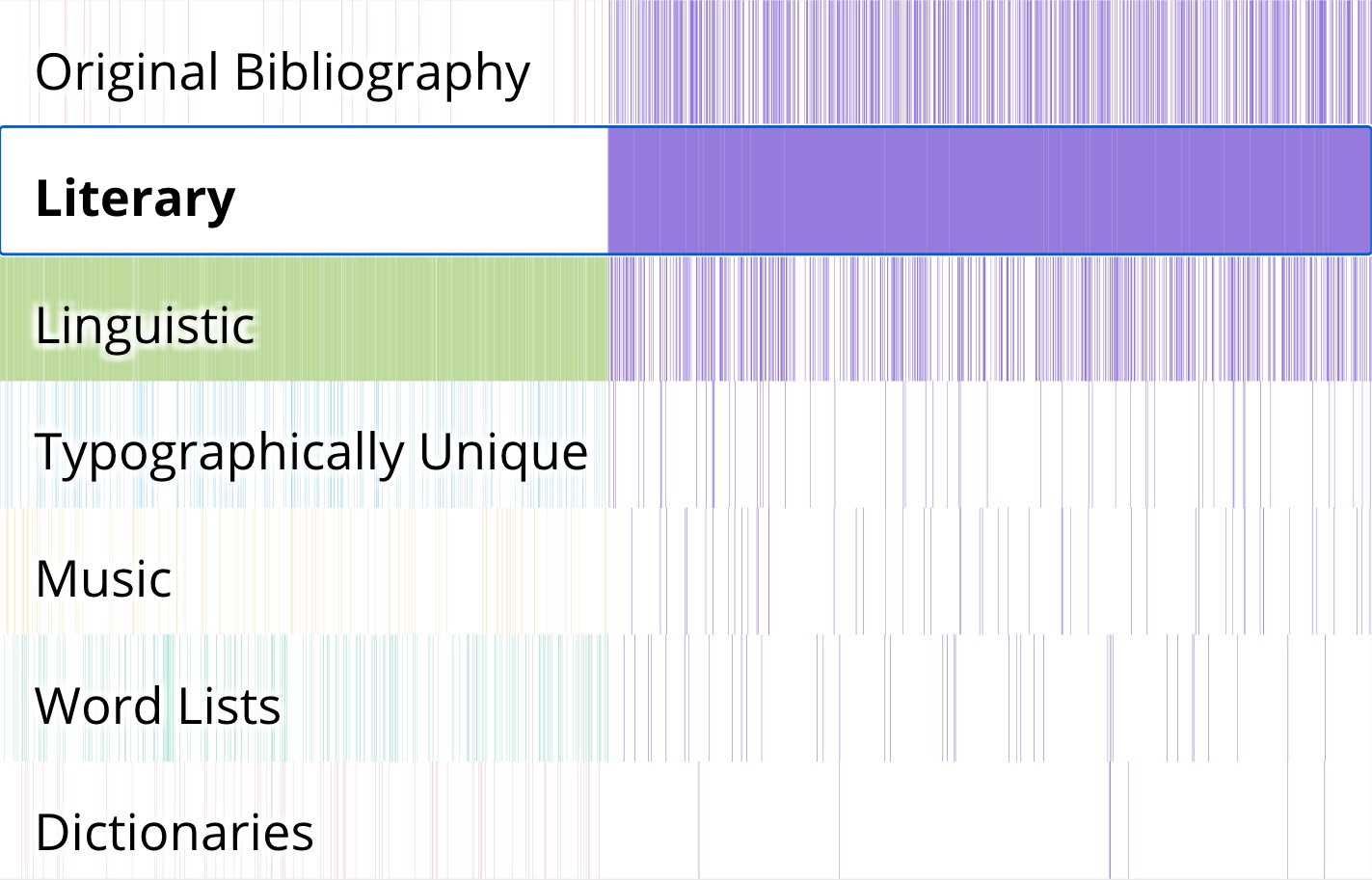 Figure 3. Screenshot of the prototype with the Literary collection selected.
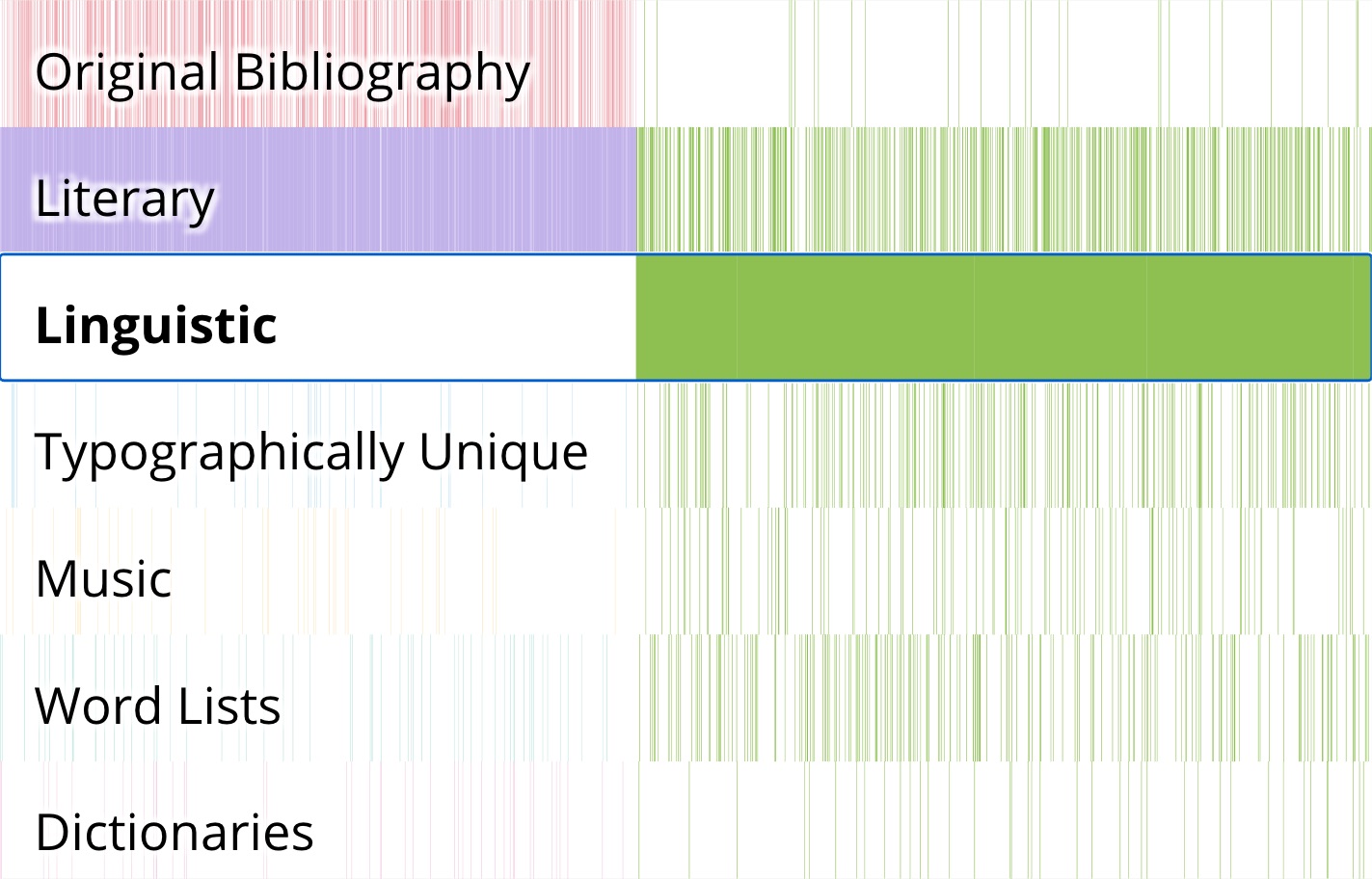 Figure 4. Screenshot of the prototype with the Linguistic collection selected.
Works Cited
Princeton Prosody Archive, version 3.2.4. Center for Digital Humanities at Princeton, 2018. http://prosody.princeton.edu. Accessed 04 October 2019.
D’Ignazio, Catherine, and Lauren F Klein. “Feminist Data Visualization.” presented at the Workshop on Visualization for the Digital Humanities (VIS4DH), IEEE., Baltimore, 2016.
Hawkins, Ed. “Warming Stripes.” Climate Lab Book (blog). Accessed October 11, 2019. https://www.climate-lab-book.ac.uk/2018/warming-stripes/.
Hullman, Jessica. “How to Get Better at Embracing Unknowns.” Scientific American. Accessed October 18, 2019. https://doi.org/10.1038/scientificamerican0919-80.
Koeser, Rebecca Sutton. 2020. “Visualizing the Collections.” Princeton Prosody Archive. January 17, 2020. https://prosody.princeton.edu/editorial/2020/01/visualizing-collections/.
Lex, A., N. Gehlenborg, H. Strobelt, R. Vuillemot, and H. Pfister. “UpSet: Visualization of Intersecting Sets.” IEEE Transactions on Visualization and Computer Graphics 20, no. 12 (December 2014): 1983–92. https://doi.org/10.1109/TVCG.2014.2346248.
Martin, Meredith. “What Is Prosody?” Princeton Prosody Archive, version 3.2.4. Princeton: Center for Digital Humanities at Princeton. Accessed October 11, 2019. https://prosody.princeton.edu/prosody/.
Rawson, Katie, and Trevor Muñoz. “Against Cleaning.” Curating Menus, July 6, 2016. http://www.curatingmenus.org/articles/against-cleaning/.
Rodgers, Peter, Gem Stapleton, and Peter Chapman. 2015. “Visualizing Sets with Linear Diagrams.” ACM Transactions on Computer-Human Interaction 22 (6): 1–39. https://doi.org/10.1145/2810012.
Roth, Suzanne S. Roth and Rebecca Sutton Koeser. “CDH and CST Collaborate as They Play with Data!” Center for Digital Humanities at Princeton, March 18, 2019. https://cdh.princeton.edu/updates/2019/03/18/cdh-and-cst-collaborate-they-play-data/.
Shneiderman, Ben, and Catherine Plaisant. “Treemaps for Space-Constrained Visualization of Hierarchies,” September 2014. http://www.cs.umd.edu/hcil/treemap-history/.