1. Abstract
In the wake of digitization initiatives, we find a wide range of phenomena in historical fields of study translated into complex, event-based data. From large-scale accounts on collective developments (such as cultural histories, art-historical movements, or socio-technical translation processes) to individual biographies of actors and objects - datafication initiatives frequently utilize event-based data formats to model complex topics as constellations of historical data points. Aside from time stamps, these data points then often are defined by further attributes, which provide their geographic, categorical, or relational specifics. The availability of such complex datasets opens new opportunities for DH research and teaching, but also for the public communication of humanities topics, and for open science endeavors.
However, when engaging in the visual analysis and communication of complex historical data, scholarly or public audiences rarely get to see their multidimensional richness. Commonly, visualization tools require analysts to selectively ‘cut’ into the complexity of the data to highlight and project particular aspects, while neglecting other facets and data dimensions. While coordinated multiple views allow us to establish plurality of perspectives side by side (Dörk et al., 2018; Roberts et al., 2019), they come with a variety of downsides on their own, including the splitting of users’ attention, and a significant amount of visual complexity (Baldonado et al., 2000; Windhager et al., 2018a). Figuratively speaking, multiple views allow us to grasp, see, and sample vital parts of the proverbial elephant, while hindering us to see the whole, dynamic organism in its particular context. If we want to overcome this state of affairs, we have to (re)connect and (re)assemble the partial impressions from multiple views for ourselves, which turns out to be a demanding cognitive task (Windhager et al., 2018a).
To provide a more integrated approach to the analysis of event-based data, we introduce the PolyCube visualization framework. As a web-based visualization system, it draws together multiple perspectives to convey a bigger picture for complex, time-oriented data, and to support synoptic exploration of the data, as well as navigation between specific perspectives for expert and casual users alike. The system provides:
- multiple spatialized (i.e. geographic and non-geographic) overview perspectives
(including a map-based, a set-based, and a network-based view), - multiple perspectives on the temporal data dimension (including space-time cube
representation, juxtaposition, animation and superimposition views) - close-up access to single events or objects on demand, together with
- animated canvas transitions, supporting the switching between various views.
To demonstrate the analytical options of this system, we turn to the field of cultural heritage studies, and showcase the visual analysis of two cultural heritage collections (Windhager et al., 2020), including the Charles W. Cushman photography collection (Indiana University, 2007), and a corpus of influential movies, based on cinematic references (Spitz & Horvat, 2014). Objects of cultural collections are frequently connected to multiple metadata entries (such as time of origin, place of origin, class of object), or to various types of relations between objects. The PolyCube system allows for the synoptic visual analysis of these data dimension - starting from a setup of multiple coordinated space-time cubes (Fig. 1) and enabling the seamless transition to three alternative perspectives on the historical or temporal data dimension (Fig. 2).
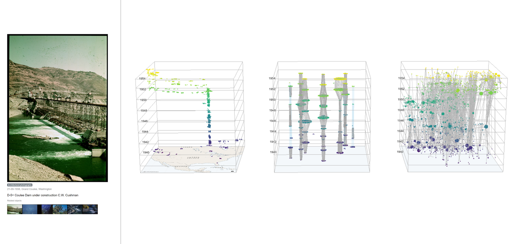 Figure 1: Three parallel views of the PolyCube system, providing a map-based, a set-based and a network-based visualization perspective (from left to right), together with a close-up view on a selected photograph.
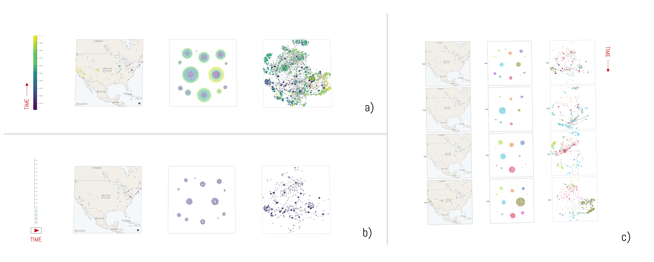 Figure 2: Three alternative views on temporal collection development, including a color-coded superimposition view (a), an animated view (b), and a juxtaposition or data comic perspective (c).
As for a general outlook, we sketch out the morphologies of a variety of further humanities topics and subject matters, which can benefit from multi-spatiotemporal representations, and for which adaptations of the PolyCube framework are under development. Transcending the point-like characteristics of cultural collection data (Fig. 3, left), actor and object biographies appear as a relevant analytical topic area. Polycubistic visualizations of traces and trajectories thus can make the movements of historical entities visually accessible in geographic, categorical and relational space-times (Mayr et al., 2020, Windhager et al., 2018b).
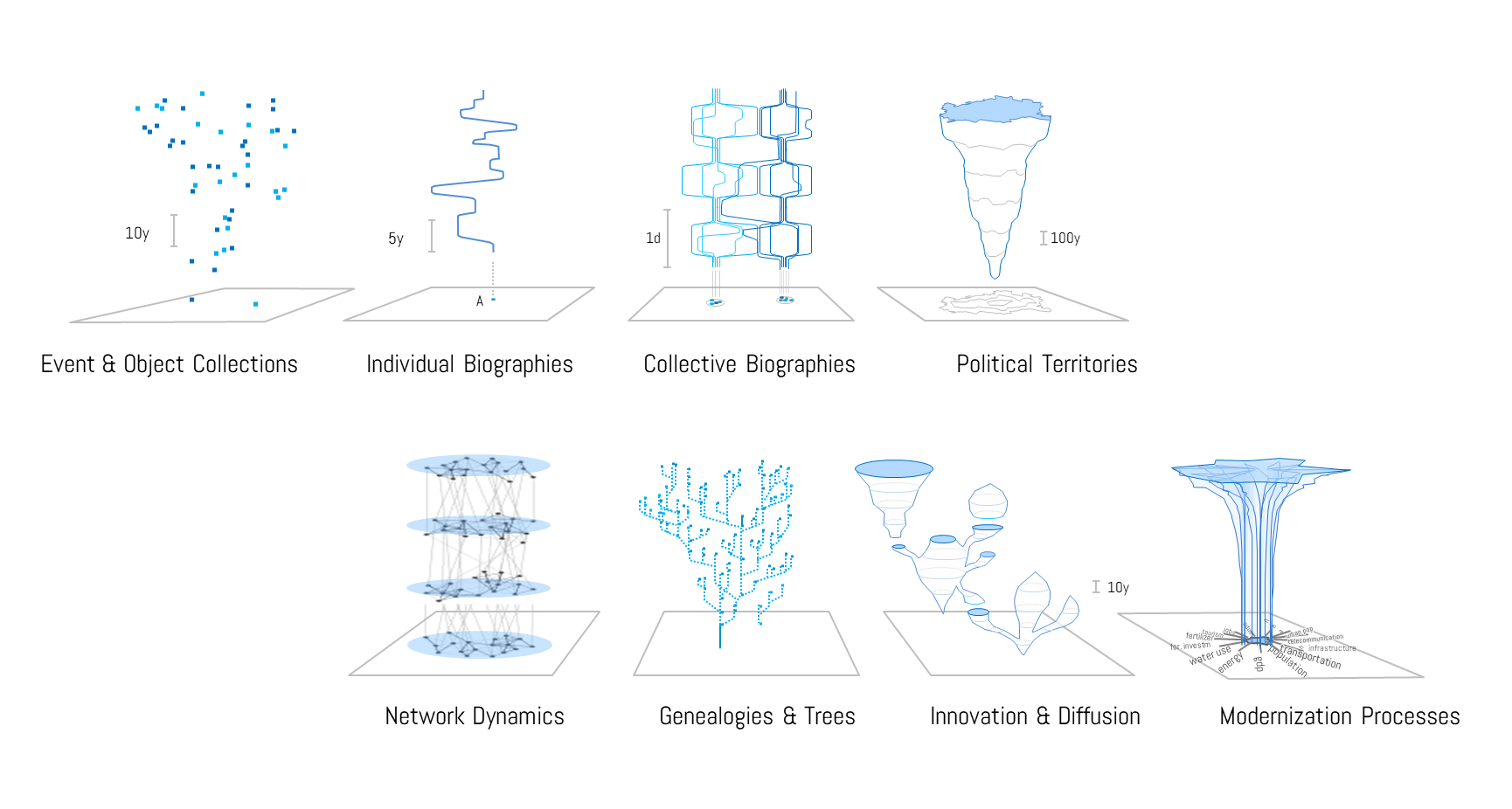 Figure 3: Outlook on a spectrum of data-driven morphologies, using space-time cube projections to make a variety of historical and conceptual phenomena visually accessible for research, teaching and public communication.
By connecting and contextualizing these basic morphological elements, data on the trajectories of political territories, on manifold actor networks, on innovation, translation and modernization processes can be remediated and rendered visible within the polycubistic framework. By creating appropriate line-ups of cubistic representations for each topic, combinatorial “meta-shapes” can appear for scholarly or public audiences, which offer bigger historical pictures for a whole spectrum of analytical or pedagogical scenarios, and around which traditional narrative accounts and argumentations can be organized. Thus we consider the suggested design to also provide one possible strategy to (re)construct and (re)assemble the shapes of elephants, hyperobjects, and miscellaneous matters of concern, which otherwise remain hidden between and behind the early stage technologies of contemporary visualization and information design (Latour, 2008).
References
Baldonado, M. Q. W., Woodruff, A., & Kuchinsky, A. (2000). Guidelines for Using Multiple Views in Information Visualization. Advanced Visual Interfaces (AVI), 110–119. https://doi.org/10.1145/345513.345271
Dörk, M., Pietsch, C., & Credico, G. (2017). One view is not enough. High-level visualizations of a large cultural collection. Information Design Journal, 23(1), 39–47. https://mariandoerk.de/papers/idj2017.pdf
Indiana University (2007). Charles W. Cushman Photograph Collection. Available at: https://webapp1.dlib.indiana.edu/cushman/index.jsp
Latour, B. (2008). A cautious Prometheus? A few steps toward a philosophy of design (with special attention to Peter Sloterdijk). International Conference of the Design History Society (pp. 2-10). http://www.bruno-latour.fr/sites/default/files/112-DESIGN-CORNWALL-GB.pdf
Mayr, E., Salisu, S., Filipov, V. A., Schreder, G., Leite, R. A., Miksch, S., & Windhager, F. (2020, forthcoming). Visualizing Biographical Trajectories by Historical Artifacts: A Case Study based on the Photography Collection of Charles W. Cushman. Biographical Data in a Digital World (BD 2019), Varna. https://osf.io/d5bse/
Roberts, J. C. et al. (2019). Multiple Views: Different meanings and collocated words. Computer Graphics Forum, 38(3), 79–93. https://doi.org/10.1111/cgf.13673
Spitz, A., & Horvát, E. Á. (2014). Measuring long-term impact based on network centrality: Unraveling cinematic citations. PloS one, 9(10), e108857. https://doi.org/10.1371/journal.pone.0108857
Windhager, F., Salisu, S., Schreder, G., & Mayr, E. (2018a). Orchestrating Overviews. A Synoptic Approach to the Visualization of Cultural Collections. Open Library of the Humanities, 4(2), 1–39. https://doi.org/10.16995/olh.276
Windhager, F., Schlögl, M., Kaiser, M., Bernád, Á. Z., Salisu, S., & Mayr, E. (2018b). Beyond One-Dimensional Portraits: A Synoptic Approach to the Visual Analysis of Biography Data. Biographical Data in a Digital World (BD 2017), 67–75. http://ceur-ws.org/Vol-2119/paper11.pdf
Windhager, F., Salisu, S., Leite, R., Filipov, V., Miksch, S., Schreder, G., & Mayr, E. (2020). Many Views Are Not Enough: Designing for Synoptic Insights in Cultural Collections. IEEE Computer Graphics & Applications. 40(3), 58-71. https://doi.org/10.1109/MCG.2020.2985368